| View previous topic :: View next topic |
| What is your favorite slogan for the shirt? |
| There is no such thing as a poor mans Porsche... |
|
7% |
[ 2 ] |
| Member {above the 924.ORG on the left chest} |
|
33% |
[ 9 ] |
| I helped save Porsche from the abyss |
|
0% |
[ 0 ] |
| Yeah that's right, I said watercooled Porsche fool |
|
0% |
[ 0 ] |
| Object is cooler than it appears |
|
7% |
[ 2 ] |
| Sure, I'll race you... But not in a straight line |
|
18% |
[ 5 ] |
| We say it... Nine Two Four |
|
0% |
[ 0 ] |
| I dare you to say it's not a real Porsche |
|
0% |
[ 0 ] |
| Though it be but small, it is fierce |
|
0% |
[ 0 ] |
| 924.ORG over the left chest and nothing else. OR a BIG 924.ORG in front |
|
33% |
[ 9 ] |
|
| Total Votes : 27 |
|
| Author |
Message |
Neil924

Joined: 18 Mar 2003
Posts: 4225
Location: Canada
|
 Posted: Fri Jan 28, 2005 9:50 am Post subject: FRONT of SHIRT slogan poll Posted: Fri Jan 28, 2005 9:50 am Post subject: FRONT of SHIRT slogan poll |
 |
|
What is your favorite slogan for the shirt?
I assume the front lay out will look somthing like this:
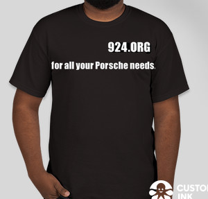
or:
The 924.ORG on the front left chest with the slogan running in the middle a few inches down. 2 lines if the slogan is longer. |
|
| Back to top |
|
 |
Neil924
Joined: 18 Mar 2003
Posts: 4225
Location: Canada
|
| Posted: Fri Jan 28, 2005 9:52 am Post subject: |
|
|
The COLOUR of the shirt can be "polled" after the slogan as it shouldn't make a difference regarding the slogan.
If you have another suggestion on a slogan, post it here. |
|
| Back to top |
|
|
Neil924
Joined: 18 Mar 2003
Posts: 4225
Location: Canada
|
| Posted: Fri Jan 28, 2005 10:06 am Post subject: |
|
|
| Whoever chose "924.ORG over the left chest and nothing else. OR a BIG 924.ORG in front" < Can you say which one, I could only fit 10 options, so I combined those two as they were close in design. |
|
| Back to top |
|
|
My924gtc
Joined: 14 Aug 2004
Posts: 1362
Location: 248
|
| Posted: Fri Jan 28, 2005 10:14 am Post subject: |
|
|
I voted small 924.org
_________________
MJ
'81 924 2.0L T
'82 924 2.3L SC/EFI <---online fall '06
Sponsor of the 944 Cup and Super Cup
Sponsor of the "2006 Battle in the Badlands" |
|
| Back to top |
|
|
Neil924
Joined: 18 Mar 2003
Posts: 4225
Location: Canada
|
| Posted: Fri Jan 28, 2005 10:24 am Post subject: |
|
|
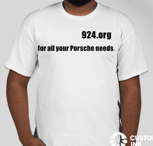
| My924gtc wrote: | | I voted small 924.org |
If just the 924.ORG is chosen, then we can make the text a little larger, to show it clearly and to take up some room on the front.
I'm just trying to get the ball rolling guys, I'm not trying to steer this in any direction but forward. If I'm out of line, post your thoughts, I just didn't want this shirt idea to drop into a void like the last attempt.
Last edited by Neil924 on Fri Jan 28, 2005 11:22 am; edited 1 time in total |
|
| Back to top |
|
|
procon
Joined: 22 May 2004
Posts: 326
Location: WNC
|
| Posted: Fri Jan 28, 2005 10:31 am Post subject: |
|
|
| My924gtc wrote: | | I voted small 924.org |
As did I. |
|
| Back to top |
|
|
Neil924
Joined: 18 Mar 2003
Posts: 4225
Location: Canada
|
| Posted: Fri Jan 28, 2005 10:37 am Post subject: |
|
|
[quote="procon"] | My924gtc wrote: | | I voted small 924.org |
As did I.[/quote
Do you guys see the slightly larger text in the 924 compared to the slogan? That's what I meant about increasing the text size if 924.ORG is the chosen suggestion. Do you agree or have another idea about size or shape? |
|
| Back to top |
|
|
maireeka

Joined: 29 Aug 2004
Posts: 299
Location: North Alabama
|
| Posted: Fri Jan 28, 2005 2:55 pm Post subject: |
|
|
I voted 'cooler than appears', because that's basically what I tell all my friends. btw,,, I know it won't win.
_________________
1977 Porsche 924 red and READY! |
|
| Back to top |
|
|
Neil924
Joined: 18 Mar 2003
Posts: 4225
Location: Canada
|
| Posted: Sat Jan 29, 2005 7:42 am Post subject: |
|
|
| I suppose when the polls are unchanged for a few days in a row we can decide the chosen option. |
|
| Back to top |
|
|
|

